Teaching art in Mongolia
Katja Brinkmann is a German artist who works in the tradition of geometric abstraction. Although based in Berlin for many years she has more recently spent time living and working in Mongolia. This essay documents the way that Mongolian culture and the teachings of Johannes Itten have converged in her role as an art teacher in Ulaanbataar between 2017 and 2018.
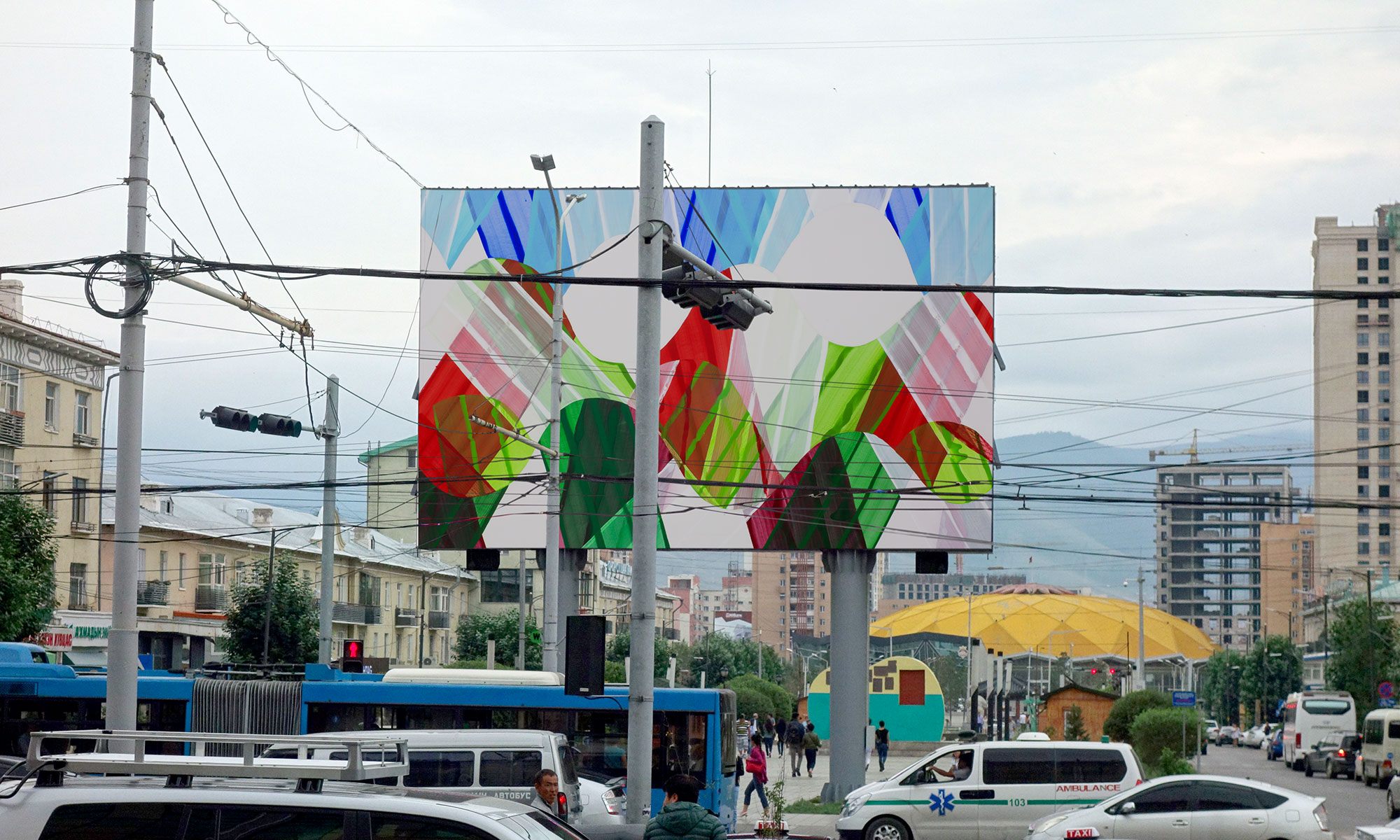
Brinkmann’s works are an exploration of abstraction through the qualities of colour and the application of colour. Merging fine gestural markings into hard-edged paintings, there is a surprising, at times jarring palette of colours – think for example, of sky blue, pale brown and a deep dark red – or the same deep red paired with mint green and lilac. The compositions vary; at times a starburst of lines that extend from a central point, at other times we see vertical stripes that are overlayed. The works animate compositional associations within the landscape, such as rays, or bands of colour. Brinkmann’s practice extends to larger public art projects too, including carpets, billboards, facades and wall paintings. In some cases, the palette is drawn directly from the location, such as the proposal for a billboard in Frankfurter Allee, Berlin, where the radial angles of a colour wheel integrate with their immediate environment.
Brinkmann studied from 1986-92 at Stuttgart State Academy of Art and Design. Her teacher, the concrete artist Paul Uwe Dreyer was grounded in the teachings of the Bauhaus when he attended college in Hannover between 1958 – 61. The influence of the colour theories devised by Bauhaus master Johannes Itten is discernable in both artists’ works.
In a sequence of unexpected events starting in 2013, (when the artist’s plans to travel to Russia were derailed), Brinkmann travelled to Mongolia and became attached to the country, its music and the people. Another trip followed soon after, with visits to Khenti, Sukhbaatar Aimag, Gobi-Altai, Bulgan, Arkhangai and Uvurkhanghai. During this time, Brinkmann immersed herself in the diverse traditions of socialist art and Buddhist art, and grappled with the motives and stories that informed these works.
Without any concrete plans, the artist followed her interests and cultivated the wish to learn the language. In late 2015 she renewed her engagement with Mongolia by studying the language in Berlin at the Humboldt University, regularly attending classes and related cultural events. When a visitor from Mongolia required accommodation in Berlin, Brinkmann – completely unaware that the visitor also happened to work as a lecturer – offered her spare room. The visitor was the Cultural Scientist S. Dulam who, after the visit, made contact with the art college in Ulaanbataar. Soon after, the college offered Brinkmann the opportunity to teach in Mongolia for a year.
From an unorchestrated – or perhaps instinctive – sequence of events, so unfolded Brinkmann’s position as a teacher at the Mongolian State University of Arts and Culture in Ulaanbaatar. From autumn 2017 to summer 2018 Katja taught art for two semesters. During preparations for the trip, and not really knowing what to expect, she packed some reference books from her bookshelf, including the colour theories of Johannes Itten, Kunst der Farbe(The Art of Colour). First published in 1961, the book is based on Itten’s experience as a master at the early Bauhaus in Weimar from 1919 – 1923.
Brinkmann taught 1st, 2nd and 3rd year art students at the university, in the nominated ‘Monumental Painting’ department for decorative and applied arts. This department is generally reserved for professional applications of painting in forms such as mosaics, wall paintings, carpets as well as oil paintings. It was a happy coincidence that Brinkmann’s own practice has at varying times incorporated wall paintings and carpets. Her approach was to view this first year as a careful observation period: to look at the practices of the students and the study program and think about how her knowledge might be relevant in this context. She describes how the students work in a predominantly figurative tradition; the way abstraction is reserved for exercises, rather than as finished work. And so, Itten’s practice, of mixing colours by means of the colour wheel, was new. In practical application it was a new experience for the students and one that incited in Brinkmann a curiosity about how the students’ work might unfold in the future.
Plans are now afoot for the artist to return to Mongolia to continue teaching. In addition, the response to Itten’s ‘The Art of Colour’ has incited a strong degree of interest so that a campaign for the book to be translated into Mongolian is now underway.
ARTIST STATEMENT
The colour plates from Johannes Itten’s ‘The Art of Colour’ were new, and very important for my lessons. Still life painting is an integral part of the strictly regulated teaching program in Mongolia which essentially dates back to the socialist era under Soviet influence.
Some short background history to traditional Mongolian painting:
Traditional Mongolian painting, which today is once more taught as a seperate artform is based on theThangka (religious devotional painting) of Tibetan Buddhism, the paint is applied flatly and colour holds symbolic importance.[i]In the socialist era (1921-1990), close ties to the USSR and Eastern Europe introduced European forms of art (in addition to classical music and ballet). In this way oil painting found its way into Mongolian art and the Buddhist artistic tradition was replaced within a short time by Socialist Realism. This style is based on training in the classical areas such as figures, nudes, portraits, and still lifes. Theuse of plaster casts of antique sculptures as study material is an important component, and is also integrated into still life painting.Even if I now work in the abstract tradition In the early stages of my own practice I was veryengaged with still life painting; as a teacher this topic suited me. The typical format for still lifes in Mongolia refer to the stills lifes of 19thcentury, they are more flat, with a lot of empty space or background. The construction of these still lifes at the Mongolian University are filled with drapery, and the colours gravitate to a more muddy palette. The arrangements of still lifes that I organized for the students looked different: these were dense arrangements of objects with clear spatial staggering, the coloration strong and clear, and limited to the basic colors. In these still lifes the intention was not for the students to render ‘beautiful’ objects like fruit, food jars, sculptures and lamps; instead I selected everyday objects of clear form and color; boxes, cartons, bottles, egg cartons, which were positioned according to painterly points of view.
An important aspect of this teaching was to enable students to understand the change of color in light and shadow. With the aid of Itten’s circle of color, I encouraged the students to practice the use of complementary colors for darkening. The mixture of gray and dark tones with only the primary colors and the resulting vibrant browns and grays was a new experience for them. The emergence of a clear spatial effect and illusion of three-dimensionality by colour does not belong in the usual syllabus. In the theoretical lessons the students learn about colour circles and the different contrasts.The doctrine of color contrasts in practical use such the influence of external surrounding colours on the perception of colour wasa new experience for the students. The students encountered my lessons with curiosity and sometimes hesitant mistrust of the unfamiliar. Lessons were conducted in Mongolian: my command of the language was modest at the beginning, but improved with time.
In my lessons, there was an approach from both sides, where I learned as much about the approach and foundations of the artistic perspective from the Mongolian students. I learned how they were looking at art and history and why they are painting in particular ways.The exchange has been beneficial for the students, teachers and I: the first year was a good basis for further cooperation, in which there was also a fundamental interest. Also pleasing was the meeting with a Mongolian publisher, shortly before the end of my work, who had an interest in my work at the university and invited me several times to his publishers. We also visited with the students to talk about my lessons. The plan, as mentioned above, is to translate Itten’s ‘Art of Colour’ into Mongolian for publication. The intention here is not for the teachings of the Bauhaus to become mainstream, rather that the students are empowered to have a broader scope of processes, techniques, tools, and perspectives so that they may forge their own voices.
Jane O’Neill, may 2019
[i]Two representatives were included in the Documenta 14: Baldugiin Sharav and Nomin Bold. For further information and images of these works see: https://www.documenta14.de/en/artists